01. Glass & Glazed Texture
This involves rendering the visual subject with a glass or glazed texture. During layout, the subject is typically overlaid on text. The transparent material causes the text to refract, creating a strong visual contrast.

02. Acid Graphics
Acid design is a style that combines characteristics such as metallic textures, holographic gradients, Dadaism, and functional materials, producing a visually “acidic” sensation.

03. Stainless Steel Texture
Many designs categorize this stainless steel texture style entirely under acid graphics. However, I believe there is a significant difference between the two. Firstly, the color of this stainless steel texture is black, white, and gray, not a colorful gradient. Secondly, the main color palette of the entire poster is typically black, white, and gray, resulting in a more understated and minimalist visual effect without the “acidic” feel.

4. Fluorescent Style
Popularized by the series of posters for the movie "Spider-Man: Into the Spider-Verse," the fluorescent style features a graffiti-like aesthetic. It employs highly saturated contrasting color combinations, creating a glaring, dizzying sensation. Nonetheless, it delivers strong visual impact and conveys a cool, trendy vibe.

5. Diffused Gradient Illustration
Diffused gradient is a gradient effect achieved through blurring, resembling the spread of ink wash. It often incorporates a slight grainy texture. Using this gradient effect to create simple illustrations results in a clean, fashionable feel, commonly applied in food posters.

06. Flat Geometric Illustration
This refers to creating purely two-dimensional illustrations using simple geometric shapes. The effect is simple and abstract. This style has long been favored by designers and is not a recent trend. However, the use of RGB colors can enhance the visual impact of the image. Combined with flexible outlines and layout treatments, this style has also become increasingly modern and fashionable.

07. New Ugly Style
This controversial design style favors bold, glaring color schemes, such as magenta paired with green. The illustrations are casual, resembling children's drawings, and the layout and composition are often non-rigorous, completely deviating from traditional definitions of good design—hence the name "New Ugly." It should be used cautiously in commercial design.

08. 3D Typography
This type of design typically focuses on text without image elements. The main text is rendered with a three-dimensional visual effect through 3D mapping or distortion techniques. This differs entirely from the usual presentation of text, resulting in strong visual impact as well.

09. 3D Illustration
The 3D world is the closest to the real world, making 3D a major trend. Combining 3D with imaginative illustrations yields even more stunning and awe-inspiring results.

10. 3D Motion Graphics
Building upon 3D, the next step is 3D motion graphics, frequently used in e-commerce design, online poster design, and web design.


11. Retro Metal
The graphics in the composition are also simple geometric shapes, but the texture is typically a rough metallic effect created using gradient tools. Combined with retro color schemes and grainy textures, it resembles posters from the last century.

12. Retro Glitch
This involves integrating the visuals and effects produced by malfunctions in early computers and electronic devices into the design. It is often combined with montage techniques (collage style) and is commonly used in artistic design.

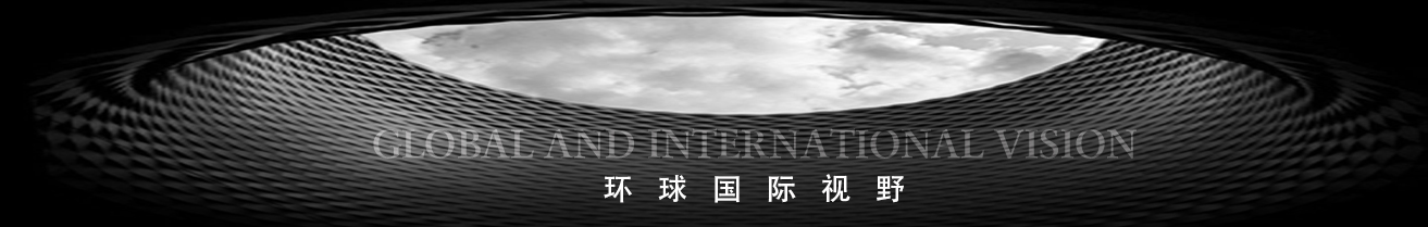
13. Techwear/Cyberpunk Style
Techwear style is not new in recent years but has gained popularity lately. The atmosphere of the visuals is relatively sci-fi, often featuring robots or mechanically augmented human figures as the visual subject. Title fonts generally use clean, sharp sans-serif typefaces. Additionally, interface frames resembling circuit board designs are common design elements in this style.